Org headings in state done no longer correctly fontified
Presumably as of merging branch refactor-headings-options, Org headings in state done are no longer correctly fontified when modus-{operandi,vivendi}-theme-headings is set to '((t . section)).
To reproduce, create an org-mode buffer and insert:
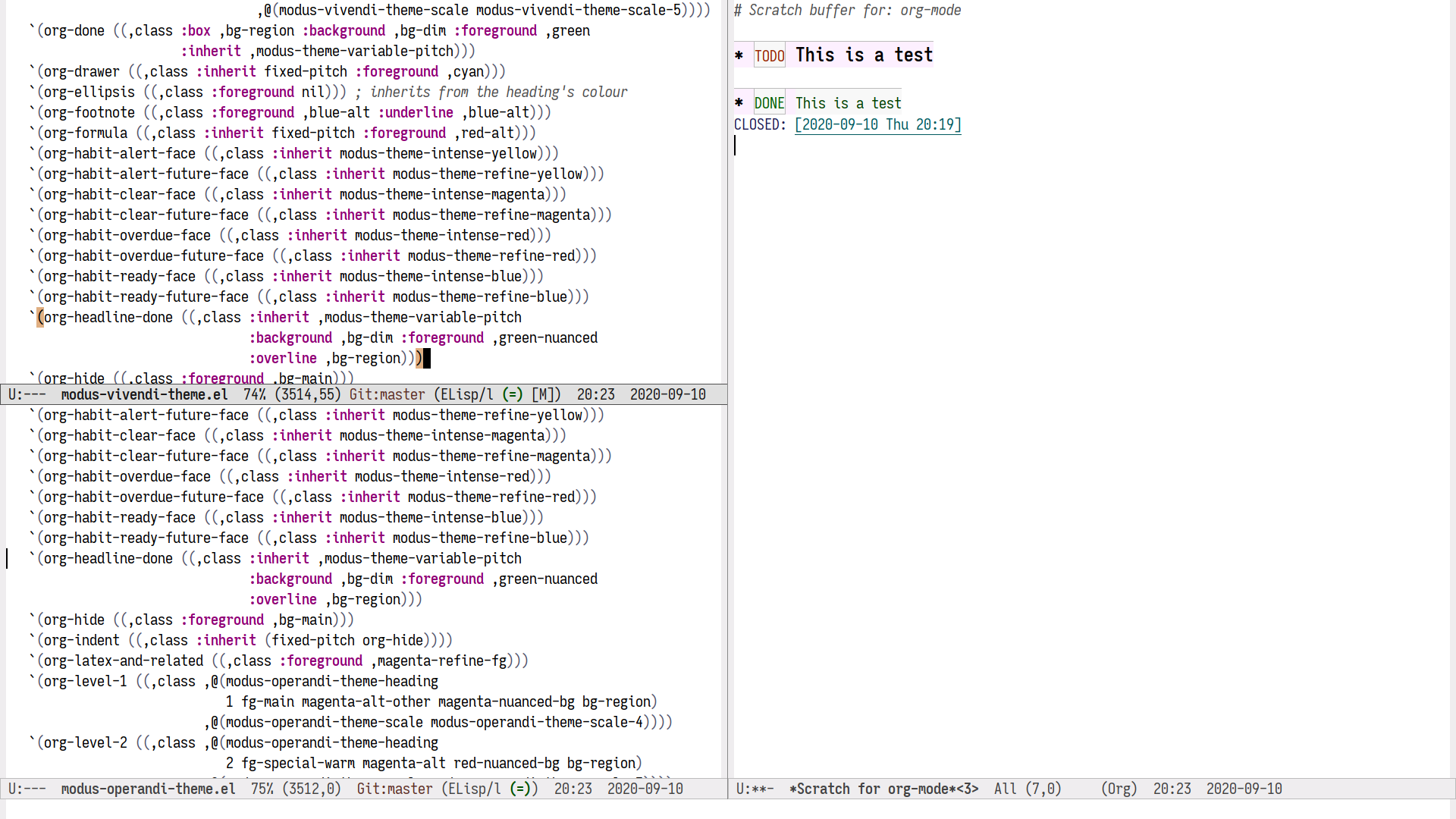
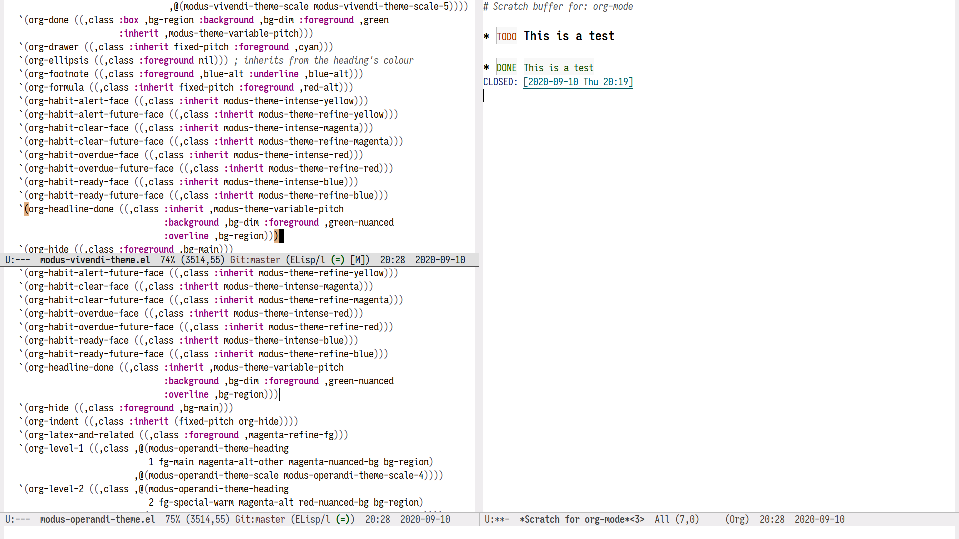
* DONE Do the thingExpected: The whole heading is fontified according to the above setting. Actual: Only DONE is fontified according to the above setting.
On a somewhat related note, as the overline color changed, the overline for org-agenda-date{,-today,-weekend} looks out of place with Org, Markdown, Info, etc.
Activity
Thank you @Koekelas for reporting this!
Org headings in state done are no longer correctly fontified
The following screenshots compare version
0.12.0onemacs -Qwith what is currently in the themes'masterbranch.0.12.0

0.13.0 (tentative)

Notes
I have indeed reviewed the faces for Org keywords and a few others. The idea was to make them more predictable and/or refine them. Perhaps we should re-introduce the accented background for the keywords? For the rest, I am open to review each of them.
Expected: The whole heading is fontified according to the above setting. Actual: Only DONE is fontified according to the above setting.
Maybe your issue is with
(setq org-fontify-done-headline t)? That would relate to theorg-headline-doneface.On a somewhat related note, as the overline color changed, the overline for
org-agenda-date{,-today,-weekend}looks out of place with Org, Markdown, Info, etc.I am not sure I follow the reference to Markdown and Info. You mean those should not follow those styles and instead keep generic headings? If so, I agree it would be fine for Info, but for
markdown-modewe do have some features that borrow from Org, likemarkdown-cycle(TAB on a heading), so I thought it made sense there.For agenda buffers, you mean this?

added custom-option label

Maybe your issue is with
(setq org-fontify-done-headline t)? That would relate to theorg-headline-doneface.I didn't know about
org-fontify-done-headline(on by default as of Org 9.4) and will turn it off. However, withorg-fontify-done-headlineset totand Modus 0.12:
And with what will be Modus 0.13:

I am not sure I follow the reference to Markdown and Info. […]
I'll try to clarify. Headings looking identical regardless of the major mode (org-mode, markdown-mode, info-mode, etc.) is a good thing. However, as of the rework, headings in the Org agenda look out of place, in particular, the harsher overline.

I didn't know about
org-fontify-done-headline(on by default as of Org 9.4) and will turn it off. However, withorg-fontify-done-headlineset totand Modus 0.12:That is, unfortunately out of the control of the themes. I can try to add an overline or something to improve the overall effect when the customisation option is on, but we still suffer from this bug (which I reported upstream and we may have something for org 9.5).
Try to set scalable headings to notice how pronounced the problem can be.
However, as of the rework, headings in the Org agenda look out of place, in particular, the harsher overline.
I shall experiment with a few alternatives and share them with you for further feedback. In general, do you think these should follow the patterns of the other headings or break from them?
-
I can try to add an overline or something to improve the overall effect when the customisation option is on, but we still suffer from this bug (which I reported upstream and we may have something for org 9.5).
Maybe it's better to wait and see what the Org authors do, there's no point in doing needless work. Now that I know the change was intentional, I feel better about it.
In general, do you think these should follow the patterns of the other headings or break from them?
I'm of the opinion that similar things should look similar. If you think of days in the Org agenda as headings, then they should look like headings. If you don't think of them as headings, then they shouldn't look like headings. Of course they also have their own requirements (weekday, today and weekend). As these faces are hooking into the heading options, I'm guessing you think of them as headings. So do I.
helpful-headingis another great candidate to hook into these settings.Edited by Nicolas De Jaeghere mentioned in issue #91 (closed)
added bug-upstream label
Maybe it's better to wait and see what the Org authors do, there's no point in doing needless work. Now that I know the change was intentional, I feel better about it.
You are right. I will still try to see whether I can somehow ameliorate the problem. What do you think about this? It "works" for sectioned and delineated headings. It feels a bit odd for the default headings, though not too much. Overall this is a compromise that, even if adopted, would need to be documented and emphasised. Basically inform users about
org-fontify-done-headlineand what the constraints are at the moment.EDIT: Notice my previous point about scalable headings, with the "done" heading not following along.
Default headings


Sectioned headings

Delineated headings

I'm of the opinion that similar things should look similar.
Agreed! And this eye for design is very helpful.
If you think of days in the Org agenda as headings, then they should look like headings. If you don't think of them as headings, then they shouldn't look like headings. Of course they also have their own requirements (weekday, today and weekend). As these faces are hooking into the heading options, I'm guessing you think of them as headings. So do I.
We agree. Let me see how I can tweak them a bit and share my findings with you.
helpful-headingis another great candidate to hook into these settings.That is from
helpful, right? Will need to check that as well. Still haven't been able to update my dotemacs.Edited by Protesilaos Stavroumentioned in commit adc6239d
mentioned in commit 1ce7b8aa
-
Done headings
Now that I understand the limitations, I would leave them alone. My fear is that, if you were to implement this, sooner or later someone else will make another issue regarding them.
Org agenda days
Very tasteful.
Helpful headings
A definite improvement. Any reason why you decided to have them mirror Org headings and not Info headings? Info headings seem more appropriate.
Now that I understand the limitations, I would leave them alone. My fear is that, if you were to implement this, sooner or later someone else will make another issue regarding them.
Agreed! Hopefully we see this fixed upstream as it will improve all sorts of combinations (todo keywords, priority cookies, the done headline, a possible todo headline, links…).
Very tasteful.
Good.
A definite improvement. Any reason why you decided to have them mirror Org headings and not Info headings? Info headings seem more appropriate.
I am not sure I follow you here. Info headings also follow Org. Example:
   `(info-title-1 ((,class ,@(modus-operandi-theme-heading
                              1 fg-main magenta-alt-other magenta-nuanced-bg bg-region)
                           ,@(modus-operandi-theme-scale modus-operandi-theme-scale-4))))

   `(org-level-1 ((,class ,@(modus-operandi-theme-heading
                             1 fg-main magenta-alt-other magenta-nuanced-bg bg-region)
                          ,@(modus-operandi-theme-scale modus-operandi-theme-scale-4))))


   `(helpful-heading ((,class ,@(modus-operandi-theme-heading
                             1 fg-main magenta-alt-other magenta-nuanced-bg bg-region)
                          ,@(modus-operandi-theme-scale modus-operandi-theme-scale-4))))
Perhaps you are seeing level two Info headings more often and like them more? I am okay with tweaking the colours to match any heading you would consider appropriate.
-
Perhaps you are seeing level two Info headings more often and like them more?
You are right, I'm mistaking the level two Info headings for level one headings! Please ignore what I said, this issue can be closed.
Thank you for your time and patience. My apologies for the feature creep.
You are right, I'm mistaking the level two Info headings for level one headings! Please ignore what I said, this issue can be closed.
Okay, closing now. Though I am still open to changing the colours.
With regard to the Org heading that sparked this issue, I will prepare a note in the manual. Basically to explain what we discovered here and to raise awareness about
org-fontify-done-headline.Thank you for your time and patience. My apologies for the feature creep.
You are welcome! No worries about that: adds some action to the development process, while it does contribute to a better end-product.
Hello again! Just to note that I changed my mind about Org agenda dates and no longer consider them "headings" in the same way others are. They will neither scale in height nor inherit a variable-pitch font, as they did before.
This is because the agenda has its own styles, which depart from the Org defaults. For example, a heading in an Org buffer may be bold, but it uses a normal weight in the agenda.
See commit 9eef7ac4.
Please let me know if this is a step in the wrong direction, or whether it needs some more work.
-
I'm fine with the change. To clarify previous statements, it's my opinion that when you decide x is a y, then x should look identical or anything but identical to other ys, not something in between.
Regarding the initial issue, fontification of done headings. I'm sure you're aware as you were involved in fixing it, it's fixed in latest org.
I'm fine with the change.
Good to know! Thought I would notify you since we covered the topic already.
it's my opinion that when you decide x is a y, then x should look identical or anything but identical to other ys, not something in between.
In which case I erred on the agenda "headings".
Regarding the initial issue, fontification of done headings. I'm sure you're aware as you were involved in fixing it, it's fixed in latest org.
Yes! Even wrote an article about it: https://protesilaos.com/codelog/2020-09-24-org-headings-adapt/
I wonder whether the devs ever try to back port fixes. Seems like this could be done for Emacs 27.2, though I understand why they would not want to go down that path.
mentioned in commit c82a754f
mentioned in commit aa992612