[SOLVED for Org 9.5] Improving contrast in org-export-dispatch
Do you think it would be possible to increase the contrast/visibility of the selected exporter in org-export-dispatch? The shortcut is C-c C-e
I've always felt the contrast is way too low in that particular view (in almost all the themes I have tried).
Anyway, thanks for the great theme, it's my favourite :-)
Activity
Thanks for mentioning this. Yes, we can always improve things. Besides, this is probably not themed explicitly yet.
I will start working right now on expanding the coverage of Org faces/styles. Please stay tuned. If, in the meantime, you have a screenshot of the current problem, please post it here.
added enhancement + 1 deleted label
In commit cb9be05a I added coverage for all
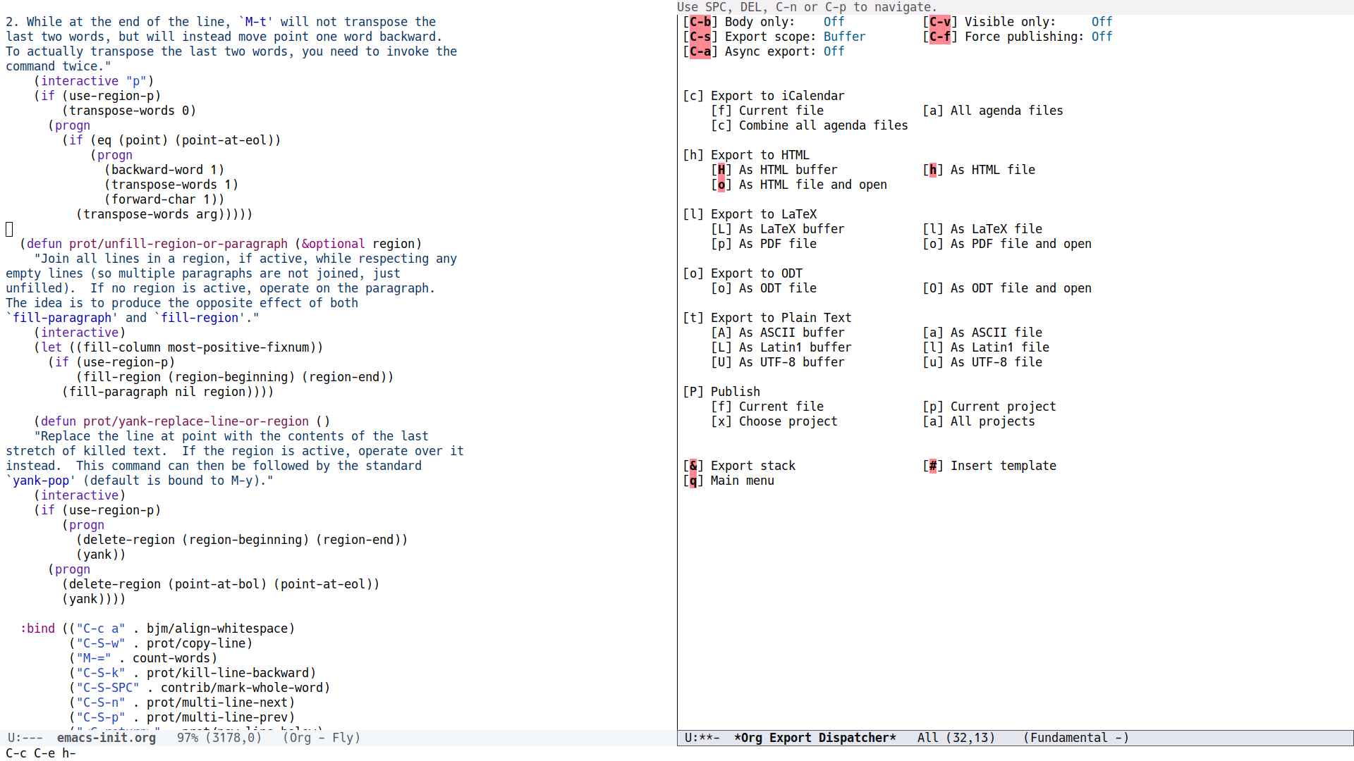
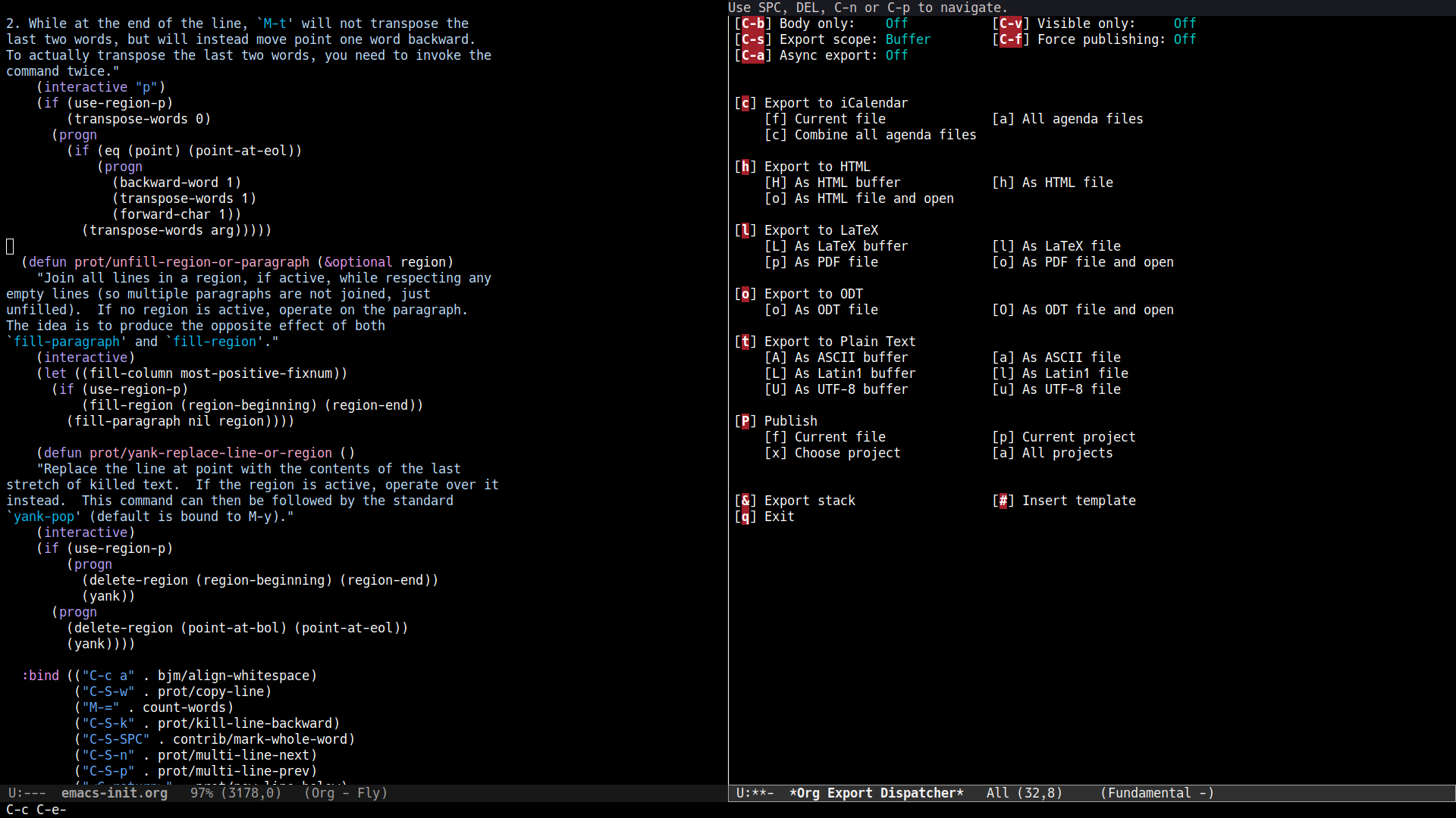
org-modefaces that are available to me (see commit for details). I am using Emacs 26.3, compiled from the latest upstream package. The Org package is the one that is built-in.On to your point, I have the following screenshots.
Modus operandi
The default screen before selecting anything:

And then the screen after selecting a heading:
Modus vivendi
Default screen:
And here with a selection:

Feedback
Please let me know if these work better.
Developer's notes
Org uses the face
org-warningwhich, in my opinion, is a misnomer. It should have something more appropriate such asmu4e-highlight-face. Ideally, there should be at least two faces: one for the options at the top (C-b, C-v, etc.) and one for the rest.I believe this issue is now done. I am closing it. Please let me know if you need something else.
Just a last point on the dev side of things: I would choose blue for this kind of action (
modus-theme-intense-blue) but because the face is called "warning" it might be used in contexts where blue is inappropriate. Yellow is generally used for warnings, but the idea is that warnings do not necessarily demand your immediate attention. So red is the only good choice left.removed enhancement + 1 deleted label
mentioned in commit 4219ea75
Hi @constno! Indeed, the colours are different. This is because we are in the unfortunate situation of having to use the
org-warningface that also gets applied in the agenda for upcoming deadlines. I had to make it just red because it would otherwise create too many problems in the agenda.We could try ask the Org developers to reconsider this particular face and to apply a bespoke face, say
org-export-dispatcher, instead oforg-warning.What do you think?
added contact-upstream label
Ah, I see. Yes, that sounds like the best solution.
I wonder why this screen is particularily hard for me to read. Maybe it is something about the black square brackets surrounding a single character in red. It might actually be related to my color vision deficiency.
Could be that this is some edge case that is hard to quantify through WCAG AAA etc.
I wonder why this screen is particularily hard for me to read. Maybe it is something about the black square brackets surrounding a single character in red. It might actually be related to my color vision deficiency.
It is not a good presentation because it relies on fine differences between a few characters that are next to each other. The least one could do is apply a bold weight to the active text or an underline.
Anyhow, I will prepare a patch and send it to the Org developers.
Could be that this is some edge case that is hard to quantify through WCAG AAA etc.
This is a case that can be handled by measuring colour distance. Yes, this is not specific to WCAG AAA, though I do try to be mindful of such awkward combinations.
I sent a patch to the Org developers. See: https://lists.gnu.org/archive/html/emacs-orgmode/2020-10/msg00158.html
added waiting-upstream label and removed contact-upstream label
Thank you very much again @protesilaos!
Fingers crossed they will include the patch.
Hello again @constno! Bastien, the Org maintainer, has just merged my patch. See: https://lists.gnu.org/archive/html/emacs-orgmode/2020-10/msg00311.html
Now this fixes the issue in upstream Org, though not in the version that gets shipped with Emacs. So you would need to run Org from source. Have you tried that before? Do you need any help in that regard (I am not an expert, but I do this myself)?
Once you try the patch, please let me know what you think about the new style. Does it work sufficiently well? If not, then we have a new face that we can customise to our liking at the theme level. Just noting this because the colours I picked for the patch were not taken from my themes' palette. Quote from my original message:
For the background+foreground combinations, the selected values conform with the highest accessibility standard for colour contrast (WCAG AAA, else a minimum contrast ratio of 7:1). I limited my options to what 'M-x list-colors-display' provides.
added solved label and removed waiting-upstream label