Color issues with profile view on GNOME dark theme
Created by: blue42u
Same vein as https://github.com/HPCToolkit/hpcviewer.e4/issues/127 and https://github.com/HPCToolkit/hpcviewer.e4/issues/132, related but not identical to either. Third time's the charm they say.
Below is a screenshot from GNOME 41 (specifically gnome-shell from Debian Unstable/Sid), "Adwaita-dark" theme:
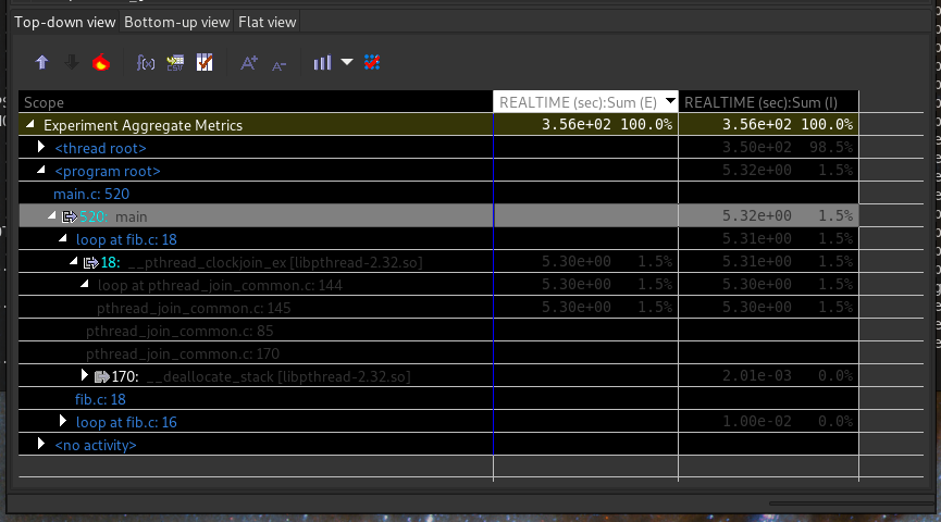
It should be obvious, but this looks really ugly. It improved a bit after 2004ca68 but it could still use some work. Specifically:
- The background color doesn't paint to the edges of the widget, which gives a poor visual effect (it seems to "melt" into the surrounding window, esp. without a border). Same goes for the selected row coloration.
- The grey used for metric values and non-hyperlink functions is dang hard to read on the black background. Using white (like
170:) would be a much better choice here. Same goes for the headers (although they seem to be slightly lighter gray). - The altered background header for the selected metric column looks really out of place, and the text is even more difficult to read. IMO just the chevron (in an appropriate color) is enough of an indicator.
- The gray for the selected row coloration somehow clashes with every other color on the line, especially the cyan
520:. It's not a good color, neither is the cyan (which doesn't look great on the black either). - The blue line marking the leftmost metric column is really hard to see against the black background, and its high contrast with the white horizontal rules causes something like an optical illusion.
- The pure-black background is far too dark to look good, especially with text in front it tends to make the text difficult to read. IMO a dark grey would do much better.
The blue for function names and tan(?) for "Aggregate Metrics" seem relatively fine, but IMO pretty much all of the colors otherwise need to be changed.
For inspiration, my terminal (gnome-terminal, system theme + Tango palette) looks like the following. I find it very readable even at the 90% opacity I usually run at.
IMO the Viewer palette should be 5 colors: background (dark grey), border + rules (just light enough grey to contrast), selected row (contrasting light grey or light desaturated blue), most text (white or off-white), and link-type text (dark-ish blue). Maybe an extra color to distinguish file/line numbers from functions (dark-ish green might work well). I also think the "Aggregate Metrics" row doesn't need to be specially colored, a mild visual separation from the headers would suffice (wider rule + bit of extra vertical spacing).