GitLab Connect Application Namespace List Polish
Minor UX improvements, keeping things lightweight.
Proposal
The new namespace selector is AWESOME, but there are a few UI polish things we could do to make it really shine.
1. Make the namespace selector modal style match the table style
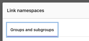
The namespace modal displays the namespaces in this fancy way: 
But the table shows them like this: 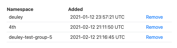
Let's make them match style, favoring the nicer one.
2. When the modal loads, focus is being set on the top tab, which is weird.
The Added section shows a UTC timestamp
Instead of displaying 2021-01-12 23:57:21 UTC, we should display the date in the relevant timezone and format for the logged-in user.