Color blind friendly mode for pipelines
I'd like to suggest how you could make your Pipeline CI/CD dashboard more accessible to color blind users.
Approximately 8% of men are red/green color blind. I'm one of them. I have trouble distinguishing small bits of red in big bits of green, and vice versa.
My employer uses GitLab to run its CI pipelines. The dashboard has icons for the jobs in it, which are green icon for success, red for failure. As I'm red/green color blind, I cannot see at a glance which jobs failed.
For example, a subset of our pipelines looks like this:
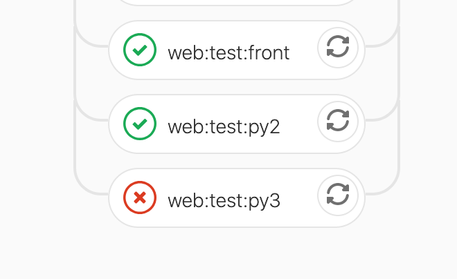
In a page full of green ticks/circles, the red circle looks green to me. I cannot see which box is failing at a glance. I need to do a careful linear scan over every box in our pipeline (about 50 boxes) in order to find the failing box.
I previously worked for Mozilla where I also had this problem. We solved it by changing the failed boxes to have a solid background, and successful boxes to have a transparent/white background. You can see Mozilla's CI dashboard with this still in use here: https://treeherder.mozilla.org
Other techniques you could consider us to make the outline of the failed box a lot bolder.
Basically, to make this easy for the 8% of your male users who are color blind, please make the features used to distinguish the things your users need to care about not based on color.
An option in your user settings to "enable color blind mode" would be sufficient if you don't want to change the UX for all users.
Thanks!