Improve Snippets' UI to improve its ease-of-use
Description
Github's Gist and Gitlab's Snippets are for posting small snippets of code. They are supposed to be a quick way to share code. But I found that gist.github.com scores far better in terms of ease-of-use as compared to gitlab.com/snippets .
There will be parts to this Description. 1. UI Problems 2. URL Changes
- UI Problems
a) UI before Login
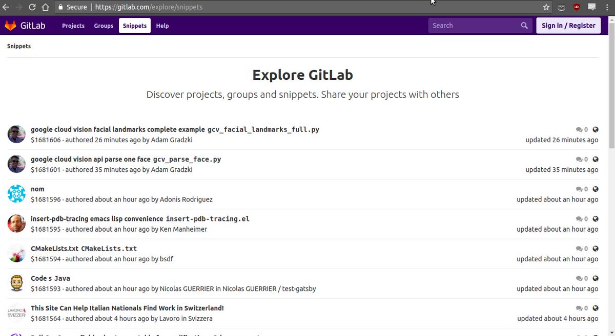
Github allows access to Gist even if you are not logged in unlike Gitlab's Snippets. I don't mind Gitlab restricting access to Snippets at all. It's completely okay.
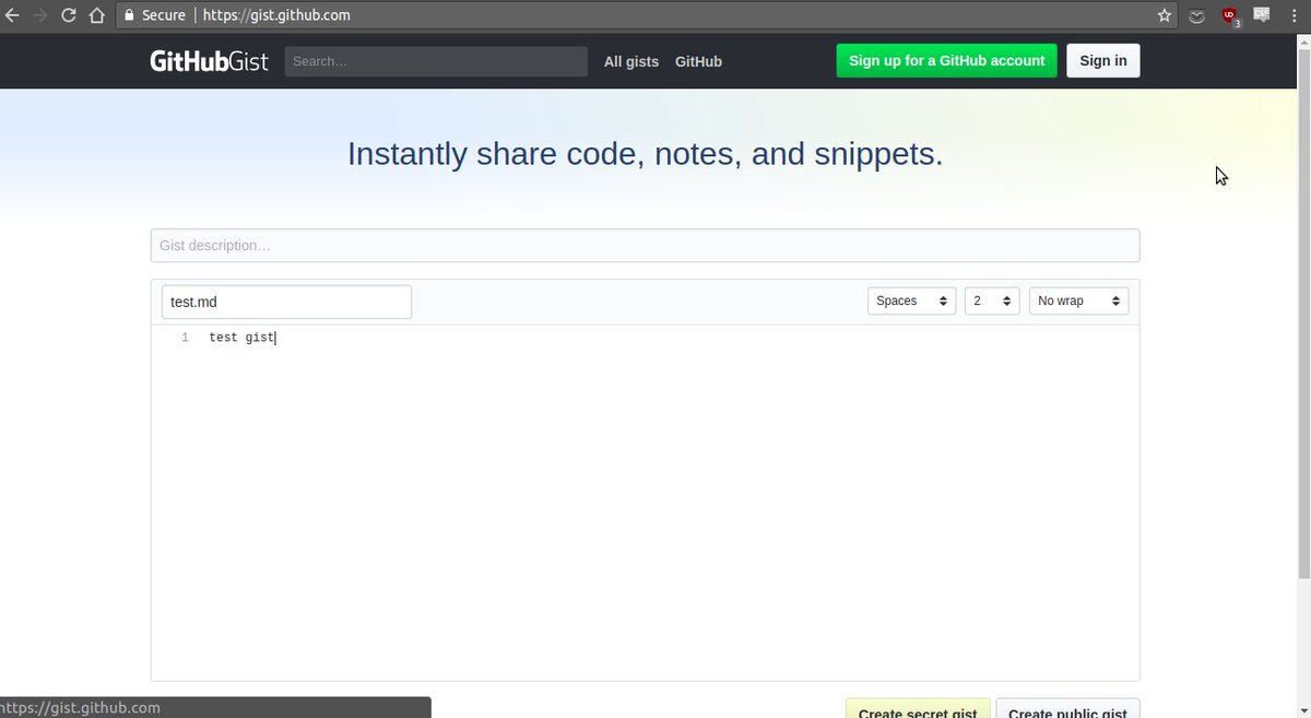
The Gist UI stays the same as that^ even after login. So I think this is a good time to look at Gist's UI, because after this I will be focusing solely on nitpicking Snippet's UI.
Github Gist UI:
- The top black navbar - with the only mention of "GithubGist" logo.
- Last three gists and a button leading to all of my older gists.
- Title
- Description
- Code - with filename with extension, Tabs v spaces, indent size, and WORD WRAP
- Private Post vs Public Post Submit buttons - in one line
I saw all of that without a scroll on my 1366*768 res screen. It has everything in one viewport without scrolling. So I can write and post my code. Easy, Fast.
b) UI after Login
Github Gist - Same
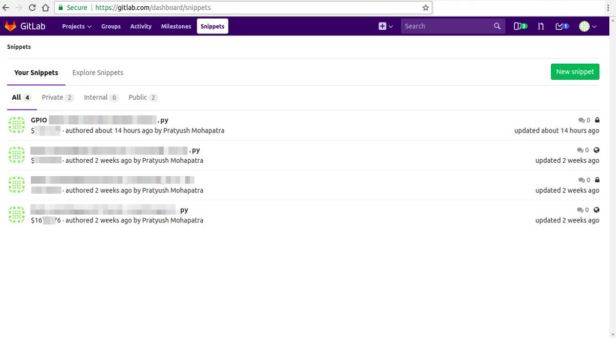
Gitlab Snippets - gitlab.com/snippets which points to "Snippet Dashboard" - It shows your old snippets first, and has moved the New Snippet button to the top right corner. So you need one extra click to get to the "New Snippet".
I feel it makes the workflow for posting a new Snippet more slow. This defeats the whole purpose of being "Easy and Fast". If this isn't enough to rile you up then wait till the next one.
c) Gitlab "New Snippet" UI
Here's the full screenshot of the Gitlab's "New Snippet" UI.
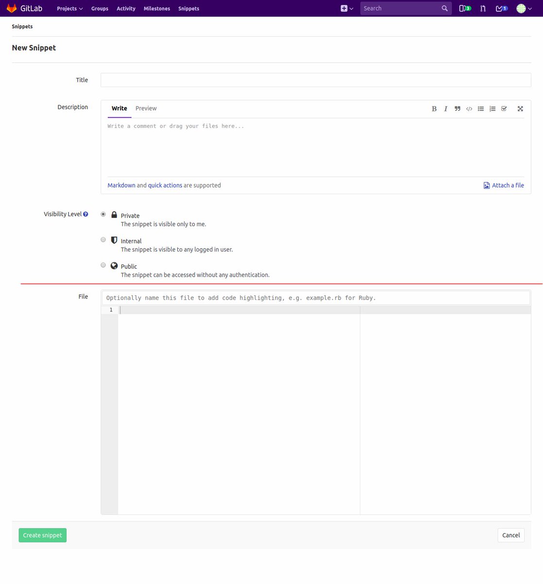
Let's count what all is here:
- Navbar - odd "Snippets"

- "Snippets" in small sized font.
- "New Snippet" in larger font.
- Title
- Description
- Visibility Level 1 Private
- Visibility Level 2 Internal
- Visibility Level 3 Public
- REDLINE (I added this) This is marks what i see without a scroll.
- File - with "Optionally name this file with extension for SH".
- Create Snippet button on the left and Cancel button on the right.

Let's nitpick all of them.
-
The Snippets and New Snippet at the top are unnecessary
- https://gitlab.com/dashboard/snippets navbar highlights "Snippets" but gitlab.com/snippets/new doesn't do this. Why?
- Both of these take too much vertical space.
-
Title is okay
-
Description - Also too much of vertical space. Makes it look very important. User might mistake this for the place where the code has to be written. It happened with me.
-
3 Lines for visibility levels? Can't we put them all in one line? Again, too much vertical space. Put visibility levels after the user's code.
-
REDLINE this shows everything that i could see in one viewport.
-
File Change everything about this. This is the most important part of Snippets but the UI makes it so unimportant.
- First of all its after a scroll.
- The name "File" is confusing. Is this an option to add an optional file?
\2. URL Changes
Right now to access gitlab's snippets directly I have to enter the URL gitlab.com/snippets
Can we change it to snippet.gitlab.com or gitlab.com/snippet ? Much more cleaner.
I feel the reason we use gitlab.com/snippets (plural) because it directs to "Snippet Dashboard" which shows multiple snippets both the users' old ones and public snippets of others.
If we could change the URL and point it directly at "New Snippet" That would make the workflow much faster to post a new snippet.
Also users can get confused between "snippet" and "snippets".
All of this depends on how madly we want snippets to become mainstream for Gitlab users and not an afterthought.
Proposal
- Gitlab Snippets UI:
This is how the Snippet UI should be(Describing it vertically, top to down):
- Top Navbar with "Snippet" Highlighted.
- Remove the top two "Snippets and New Snippets". Instead put the last few snippets on this line and link to all the old snippets(Snippets Dashboard) in the rightmost corner on this line.
- Title is okay
- Desciption - Make this 1 or 2 lines but its size should be extensible. And Markdown Support. Preview is okay
- File
- First of all rename this to "Your Code"
- Move "Your Code" to right below Title.
- Add Word Wrap
- Add Indentation Type and Indentation size
- Cancel Button ("Cancel" in red), Visibility Radio Buttons, Post New Snippet Green Button
- URL Changes
Right now to access gitlab's snippets directly I have to enter the URL gitlab.com/snippets
Can we change it to snippet.gitlab.com or gitlab.com/snippet ? Much more cleaner.
I feel the reason we use gitlab.com/snippets (plural) because it directs to "Snippet Dashboard" which shows multiple snippets both the users' old ones and public snippets of others.
If we could change the URL and point it directly at "New Snippet" That would make the workflow much faster to post a new snippet.
Also users can get confused between "snippet" and "snippets".
All of this depends on how madly we want snippets to become mainstream for Gitlab users and not an afterthought.
Links / references
Documentation blurb
Overview
What is it? Problems with Gitlab's Snippets UI and URL which if imporved could increase its usage and reduce time taken to complete one usage. Easier workflow should increase its usage. Why should someone use this feature? What is the underlying (business) problem? Makes Snippets worse than gist and other such services. Makes it slow for users to use it. How do you use this feature? I try to use this everyday. But I know it could be faster.
Use cases
Who is this for? Provide one or more use cases. For all Gitlab users.
Feature checklist
Make sure these are completed before closing the issue, with a link to the relevant commit.
-
Feature assurance -
Documentation -
Added to features.yml