Restyle body content of docs.gitlab.com for better scannability
Problem to solve
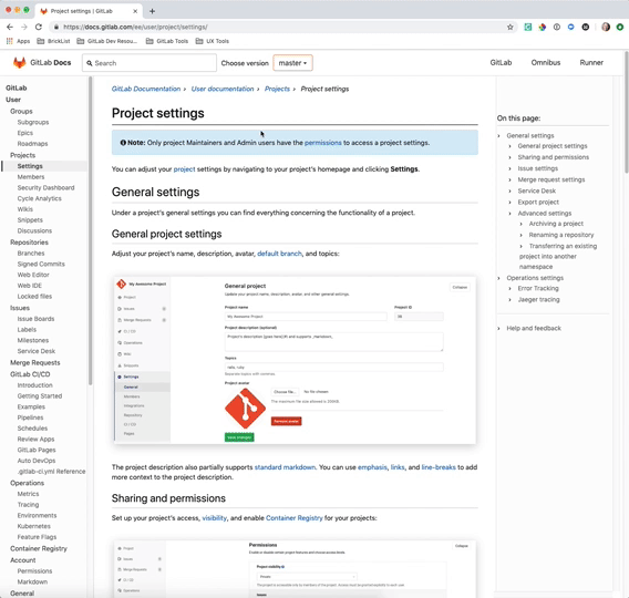
Body content on docs.gitlab.com is extremely difficult to scan.
- Content hierarchy is broken by borders underneath every header.
- Breadcrumbs take up a lot of space (font size and space between links/carets).
- Border under H1 too visually heavy (and likely unnecessary).
- Borders under H2 and H3 elements separate the header from its associated content.
- Headers are same color as body content. Hard to visually parse.
- Top margin of H2 isn't enough to create visual distinction from previous section.
- Visual difference between H2 and H3 is too minimal.
- Top margin (maybe line height? both?) of body content is too much - separates the content from its associated header.
Intended users
Users of GitLab's documentation site
Proposal
I mocked up some of these suggestions in the browser to show how they might look. Not meant to be perfect or prescriptive—just to show the impact that some minimal visual changes might have.
BEFORE VIDEO:
AFTER VIDEO:
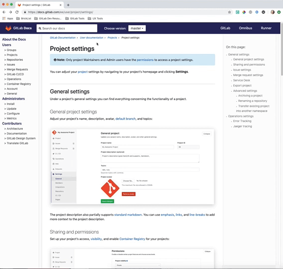
IMAGE FILES FOR BETTER CLARITY:


What does success look like, and how can we measure that?
The visual relationship of related content is clear and content is easy to scan.